Coda
Problem
Role
Duration
Older adults of the Baby Boomer generation and their grown up children are wholly unprepared to tackle the topic of end-of-life care. 72 percent of parents expected one of their children would assume long-term caregiver responsibilities in retirement, yet 40 percent of the kids designated to fill the role did not know this.
Researcher
Prototyper
Designer
September 2021 - December 2021
Solution
Tools
Skills
Coda is a toolkit for creating, storing, and sharing essential end-of-life plans, guiding users through end-of-life planning in four chapters via offline and online experiences. Each chapter contains interactive prompts and exercises based on key stages within the planning process. Coda also invites users to designate a trusted circle of family, friends, and advisors to play key roles in the planning and postmortem phases of their journey.
Figma
Photoshop
Blender
Substance Painter
Premiere
Literature Review
Qualitative Interviews
Rapid Ideation
Rapid Prototyping
Evaluative Research
Video Editing
Once logging onto our website and creating an account, users can order the Coda toolkit for at-home delivery. Coda guides users through end-of-life planning in four engaging chapters via an ecosystem of offline and online experiences which delve into the health, legal, and sentimental aspects of end-of-life care. Chapters insinuate a journey; this process is not a one and done deal, but a voyage you take with loved ones.
For our final presentation, I worked on both the video presentation as well as the 3D models of our concept Coda. The interface's visual design was done by my team member Sookie Lee, and I provided their motion designs/animations.
Chapter One: Introduction
The first chapter serves as the introduction into our service. With flashcards of key end-of-life care terms and activities that help to outline late-health goals, recipients can introduce the conversation of death with friends and family.
Chapter Two: Post-Mortem Plan
In chapter two, users begin to draft their will and create a post-mortem plan. Plus, they can record their online account details (bank accounts, social media accounts, etc.) of their choosing, so that they after their death, their loved ones (designated their Coda Circle) will be able to access crucial information.
Chapter Three: Insurance
In chapter three, we provide forms and resources for the user to enroll in long-term care insurance as well as prepare for their key advance directives in case of medical emergencies (Do not resuscitate orders, for example).
Chapter Four: Parting Words
This chapter prompts users to draft their own obituaries, and encourages them to write parting letters to their loved ones. The hope is to have the senior reflect on their lives and loved ones, and let their emotions out as they prepare for the future.
Participant 3
I would like to think that our kids have seen us take care of the previous generation, so I’d hope that they’d step up, not financially, but physically and emotionally

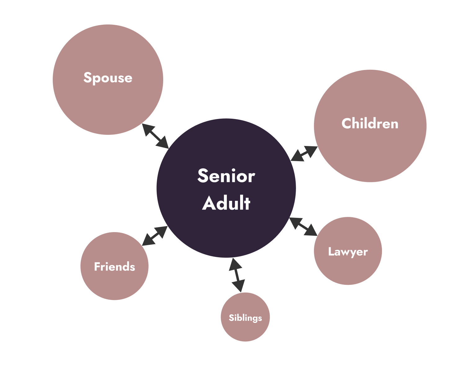
The stakeholders of Coda.
We conducted qualitative interviews over Zoom with our main audience, adults over 65. From various survey posts we made on several websites (I posted on Nextdoor), we managed to get 7 interview participants. I moderated and took notes during the interviews.
What we were trying to gain from the interview was an understanding of the importance of autonomy amongst older adults, their willingness to share sensitive health information with family, and their overall end-of-life plans (and any painpoints they had during that journey). We then affinity diagrammed our findings.

Myself and my teammate Stephon conducting an interview over Zoom.
Insight 1: Lack of Awareness
Some people lack a basic awareness about the need for long-term care coverage. They assume that life insurance, health insurance, or disability insurance will cover them until a lawyer or financial planner informs them otherwise.
Insight 2: Great Expectations
Everyone hoped that a family member (usually their child) would contribute to their long-term care, either financially, physically, or emotionally. However, most hadn’t shared that and were unsure about if/when they would initiate that talk.
Insight 3: Disclosure Gap
While most people are comfortable sharing personal health information with doctors, lawyers, and insurance representatives, they prefer to keep family on a ‘need-to-know’ basis until absolutely necessary.
HOW MIGHT WE
empower older adults to plan for their future so that they may achieve their end-of-life goals?
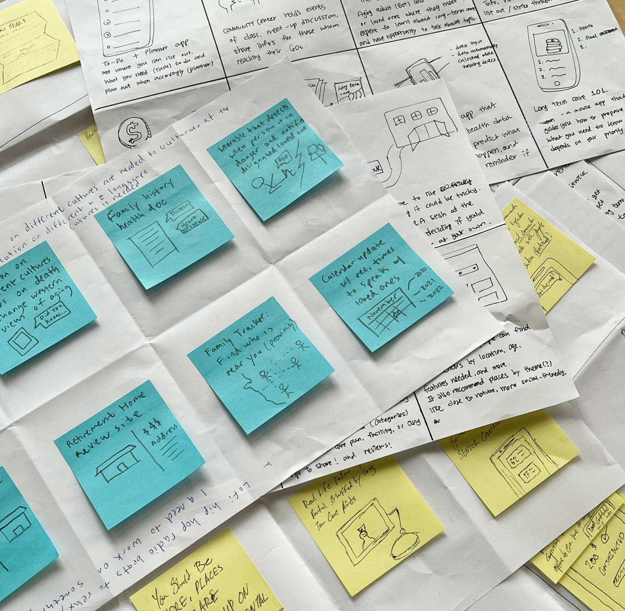
Based on our desired outcomes, we each ideated 30 ideas for a total of 120 ideas. We grouped our ideas into 4 categories:
- End-of-Life Preparedness
- Finance Building.
- Awareness Raising
- Community Building
Of our ideas, we downselected to 3 ideas using dot voting, based on whether it was useable amongst seniors, affordable in terms of pricing, targeted to solve a discreet problem, and inclusive so as to not exclude or marginalize any populations.
From this downselection we chose 3 ideas, and after continued feedback from our peers through project presentations, we ultimately decided to focus on End-of-Life Preparedness.

Our ideas ranked by our criteria.
Coda
Our chosen idea is an end-of-life toolbox that’s a safe house for documents and protocols. Originally called Blue Box, it is a service that encompasses the conversation around long-term and end-of life care. It revolves around 4 stages, sent at different times of your end-of-life journey.

The storyboard of Coda (drawn by me).
My Role in Prototyping
Whereas my groupmates focused on prototyping the online application interactions, the physical activities, and the outreach, I looked into:
- the physical toolkit experience
- online user-created content
Toolkit Prototype Concepts
Participant 2
I really like it in the sense that I think it's important to have conversations about these things so I just think it's a good thing to be talking about.
For the physical toolkit, I focused on making a case that could be accessible and manipulable yet secure. I investigated different types of material, form factors, and sizes to make a package that older adults would be comfortable with using.
Idea 1: Notched Case
This notched, plasticized case would allow for easy content viewing, while being mostly safe. A magnetic strip would be a simple lock, while documents would be stored in individual cases (according to chapter).
Positives
- Magnetic strip and plasticized case make documents feel secure.
- Notched case allows for easy viewing of internal contents.
Negatives
- Might not be secure with excessive rough handling.
Idea 2: Lockbox Case
A secure lockbox with a fingerprint activation lock. It can be stylized like a jewelry case for that luxurious feel.
Positives
- Secure and can withstand tampering and fire.
Negatives
- Might be too heavy for extensive handling.
- Materials may be too expensive to make it accessible.
Idea 3: Folder Case
A simple folder that can hold secure documents. Foldable for easy portability.
Positives
- The most portable of the 3.
Negatives
- Materials may be too expensive to make it accessible.

Physical prototypes of Coda's case (produced by me).
Since I did not have access to the materials (nor the funds) to prototype the case ideas in full, I decided to focus on their form and meaning. I made 2 physical prototypes for the Coda toolkit out of cardboard and foam core to experiment with the form factor.
I tested it amongst various users in order to get a sense of how it would feel to manipulate and hold, as well as how effective of a symbol it would be as a reminder of one’s end-of-life care.
Toolkit Prototype Testing

Testing out one of the case prototypes.
I tested it amongst various users in order to get a sense of how it would feel to manipulate and hold, as well as how effective of a symbol it would be as a reminder of one’s end-of-life care.
Insight 1: Bulk
The box containing the kit cannot be too big, heavy, or bulky lest it be hard to manipulate, especially when the user might have a physical condition (such as Parkinson’s).

Affinity diagramming quotes from prototype sessions.
Insight 2: Customizable
Users want their box to be suited to their tastes when it comes to its physical appearance. This was a big step in their lives; they wanted their box to be reflected as such.
Insight 3: Safety
Users wanted to know their sentimental and sensitive documents were safe. This ranged from a magnetic cover to an advanced locking mechanism on the box.
Coda Community Concepts
Participant 3
“Some things are very personal, like ‘10 Things I’d Like to Leave Behind’, I don’t think people would share that information.

Coda Community concept prototype (created by me in Figma).
Coda Community Testing
I made a prototype of a sample website tab dedicated to community content, including answers to activities, user created templates and activities, answers to commonly asked questions, and a scheduled newsletter. The idea this tab was to see if an open community over end-of-life care was conducive to aiding one’s own “death” journey, as well as destigmatizing the talk around death.
I tested this concept with 3 people to see if they found it insightful, tasteful, and informative.

Testing the Coda Community concept prototype.
Insight: Dissonance
There is a dissonance between the “social” aspect and the sensitivity/serious nature of the topics that are covered. Is this “social media” aspect a proper venue for deep insightful thought in the topics of end of life care or death?
Based on these insights, we made these changes:
- The community tab is removed: we decided that the emotional significance of death was a lot for many users to rationalize with the perceived “frivolity” of social media. Another method to normalize “death” will need to be investigated.
- We decided on a plasticized case, especially with a magnetic cover, because it was a good mix of secure but manipulable. We also incorporated aspects of the folder for each chapter.
- The designs on the box would be customizable, depending on the aesthetic choices and emotional needs of the user.
- Declare clearly the benefits of our plans in our website and toolkit: we set out to make not only Coda’s message clear, but also the reason why one should complete our toolkit, since it wasn’t always immediately apparent in many of our user tests. Users should know why they are doing these activities.
Test our web and physical prototypes with our target audience; older adults.
We did a lot of prototype testing, but we did not have the time nor the ability to visit older adults during the quarter, especially due to the ongoing pandemic. We supplemented our decisions with interview data from older adults, secondary research, and speaking with subject matter experts. Still, we ideally would want to test with our target audience, and get the test kit into the hands of older adults.
Seek law experts, therapists, etc. to flesh out our chapters and activities.
We took a lot of inspiration from existing activities on speaking about death with loved ones, such as Death over Dinner. If given more time we would have loved to consult professional end-of-life experts or therapists to help construct our own activities which we could present in our format.
Senior care is a wicked problem which you can’t fix with one design.
Caring for older adults and changing the mindset around end-of-life care (especially in regards to family) might take a shift in public thought as well as multiple government policies to fix. In order to affect change, we have to start the process, for others to see and improve upon.
Time and resources affect who you interview, which can skew your data.
The platform we used, the time we had, the lack of money we were given, all play a part in who we can speak to and what we can do. I realized that more care needed to be put into how we recruit our interview participants. We got most of our participants from Nextdoor, and they all tended to be upper middle class and tech-literate, and thus had a lot more money to spare than the average citizen.
Keep your message simple; don’t confuse your target audience.
Due to the confusing of whether this was an online or offline platform, something I realized was simple is better. We needed to concisely share our message, and share why we think it’s important, whether or not we are right. It’s all about learning!


